


Why the Listing Flow Needed a Complete Rethink
Sellers were telling us the same story over and over. Too long. Not sure about the price. Started on mobile, gave up on desktop. These weren't complaints about edge cases. They were signals that the core experience was broken.
As the design lead on this project, I made the call to treat AI not as a feature to bolt on, but as the foundation of a completely reimagined flow. The result was Magical Listings: a product that uses AI as a genuine co-pilot for sellers, not a shortcut that takes the wheel away from them.
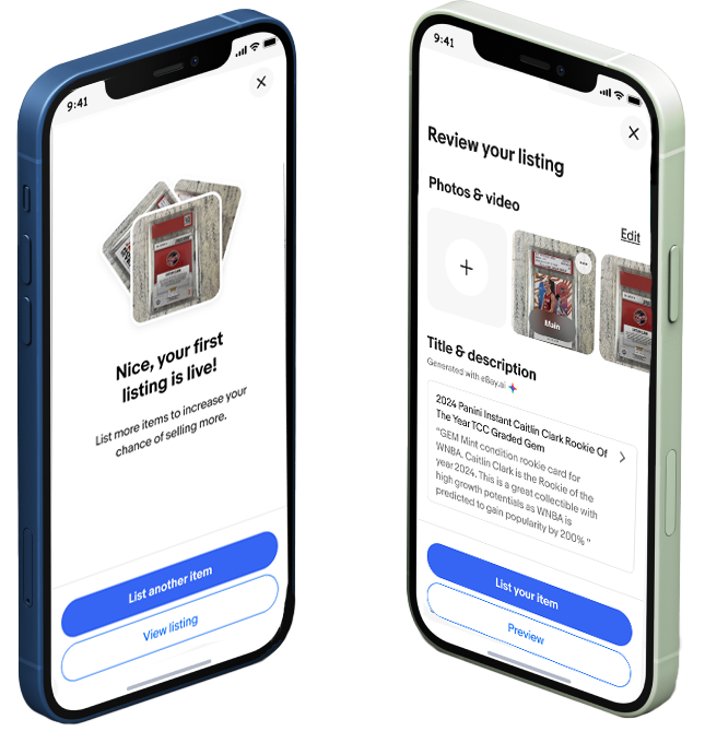
Magical Listings overview — the final AI-powered listing experience on eBay
Five Calls That Defined the Product
Designing AI into a product used by millions of sellers means making decisions that don't have obvious right answers. These are the five that shaped everything.
Every AI-generated description, price suggestion, and spec fill was made fully editable and regenerable. Research was unambiguous: sellers who felt AI was deciding for them rejected it entirely, even when the outputs were better.
+18% successful listings from sellers who had previously abandoned the flowA single number recommendation felt arbitrary. Adding a confidence range anchored to recent comparable sales turned a guess into a reasoned suggestion. Sellers didn't just want the right answer. They needed to understand it before they'd act on it.
+34% price suggestion adoption in A/B testingThe traditional listing entry point was an empty form with 40+ fields. It was the single biggest source of abandonment. Reframing the entry point around a photo completely changed the paradigm: AI recognized the item and pre-populated category, condition, and key specs. Sellers confirmed or corrected, rather than starting from nothing.
+28% specification accuracy · 40% less average listing timeEarly testing showed sellers rejecting AI descriptions that were technically accurate but felt robotic. Introducing a tone toggle backed by carefully engineered prompts gave sellers AI output that actually felt like their own voice, dramatically increasing adoption.
Sellers described AI descriptions as "sounding like me" in post-launch interviewsCompletion rate alone would have been misleading. Sellers were already completing listings, just with low confidence and high abandon intent. Adding a single post-listing confidence question as a tracked KPI forced the team to optimize for seller trust, not just throughput.
+21% cart add-rate · +17% listing-to-sale conversionListening Before Designing
Before a single wireframe was drawn, I spent weeks in the field. Diary studies, side-by-side usability sessions, and in-depth interviews with sellers across every experience level. The stories were consistent, and they were telling.
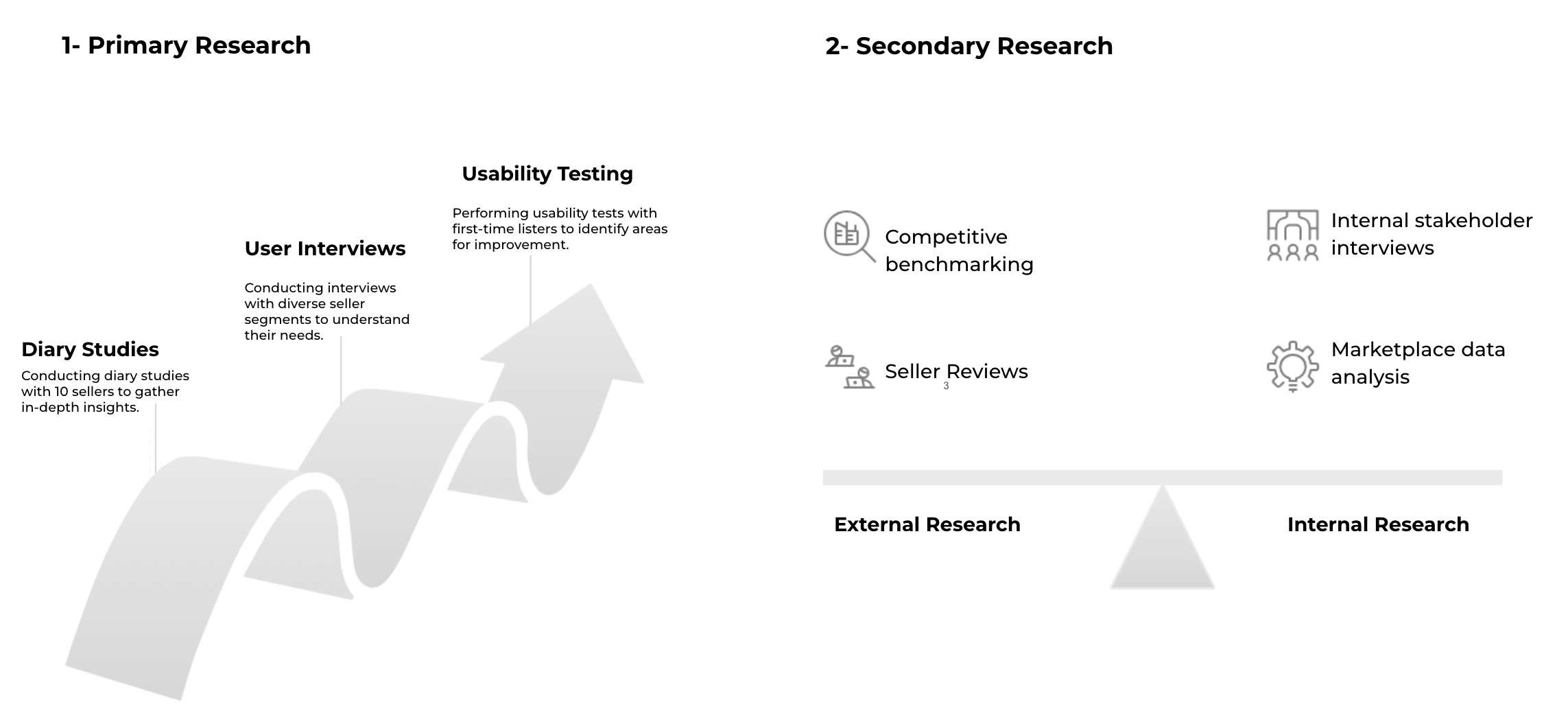
Research approach — primary research (diary studies with 10 sellers, user interviews across seller segments, usability testing with first-time listers) balanced against secondary research (competitive benchmarking, seller reviews, marketplace data analysis, internal stakeholder interviews)
"I don't mind selling, but I never know how to describe my items well. I end up guessing and hoping for the best."
"Pricing feels like guesswork. I don't want to undersell, but I don't want my item sitting for months either."
"I start on my phone and give up when I get to desktop. The experience is completely different. I lose everything."
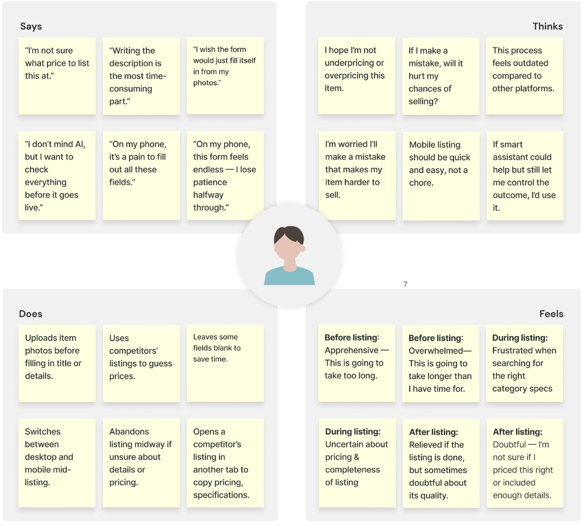
Seller empathy map — synthesized across 24 interviews. Sellers say one thing publicly, but think about mistakes, price anxiety, and platform comparison internally. They do workarounds: competitor price copying, leaving fields blank, switching devices mid-flow. They feel apprehensive before, frustrated during, and doubtful after.
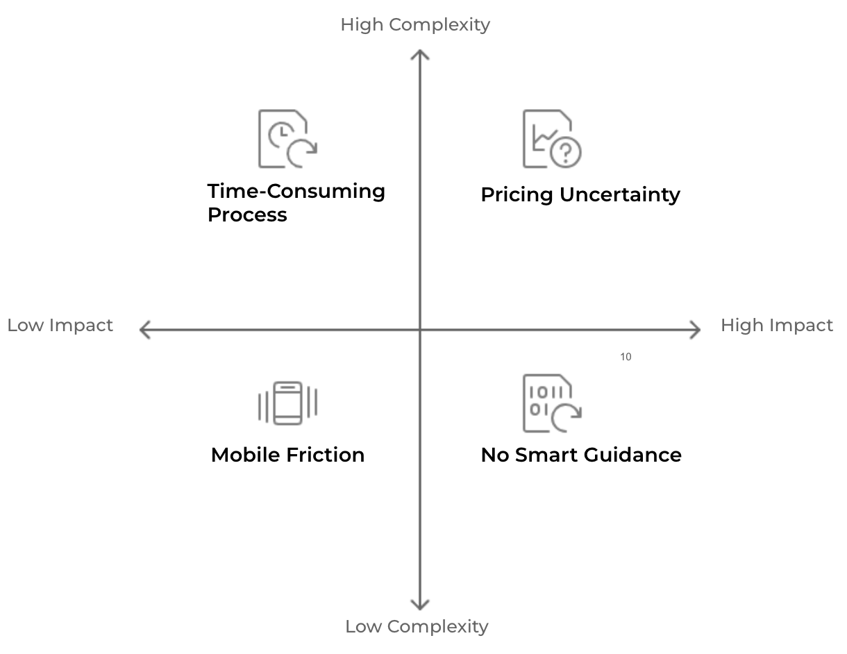
Pain point prioritization matrix — plotting impact vs. complexity revealed the critical opportunity space: Pricing Uncertainty (high complexity, high impact) and No Smart Guidance (lower complexity, high impact) were the clearest targets for AI intervention
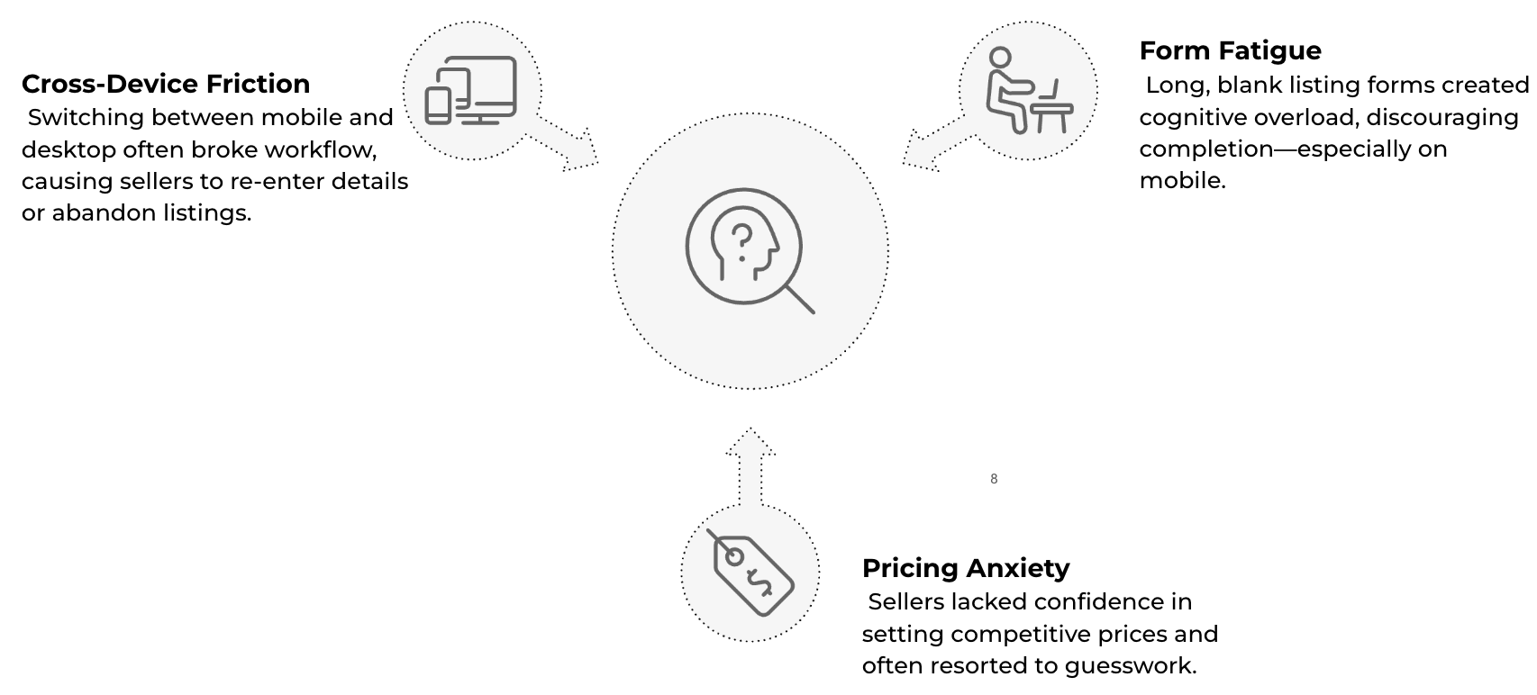
Three core insights — Cross-Device Friction (workflow breaks when switching mobile to desktop), Form Fatigue (blank 40+ field form causes abandonment, especially on mobile), Pricing Anxiety (sellers resort to guesswork and competitor copying because they have no trusted signal)
Core Research Finding
Sellers value speed and confidence equally. They want tools that help them list faster, but never at the expense of control or accuracy. Any AI feature that felt opaque or removed their agency would be rejected immediately. This became our design north star.
Framing the Challenge
With research synthesized, I brought the team together to align on a single design challenge. Getting this right mattered more than it sounds. When teams skip this step, they end up solving the wrong problem with very polished solutions.
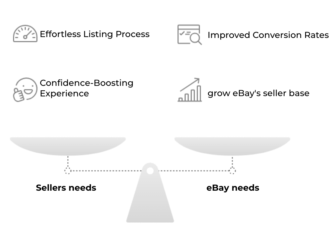
Balancing two sets of needs — sellers need an effortless process and confidence-boosting experience. eBay needs improved conversion rates and a growing seller base. The design challenge was finding the solution that serves both sides without compromising either.
Mapping the seller's current journey exposed exactly where confidence collapsed. The "Then" flow had too many decision points and too many exits. The "Needed" flow had one key intervention: AI generates the draft, the seller reviews and publishes.
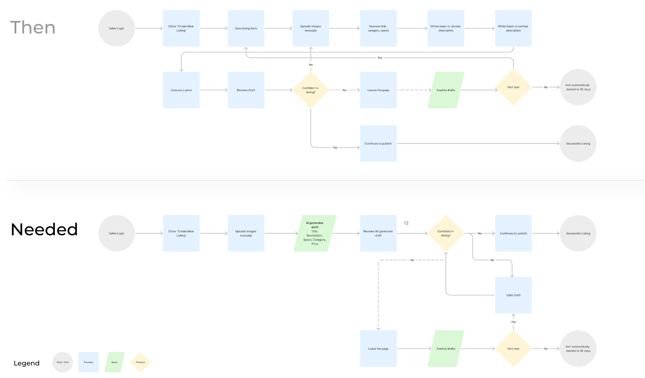
Then vs. Needed journey map — the existing flow branched into saved drafts, abandoned sessions, and auto-deleted listings. The new flow collapses the listing process into: upload photos, AI generates draft (title, description, specs, category, price), seller reviews, seller publishes. Fewer steps, more confidence at each one.
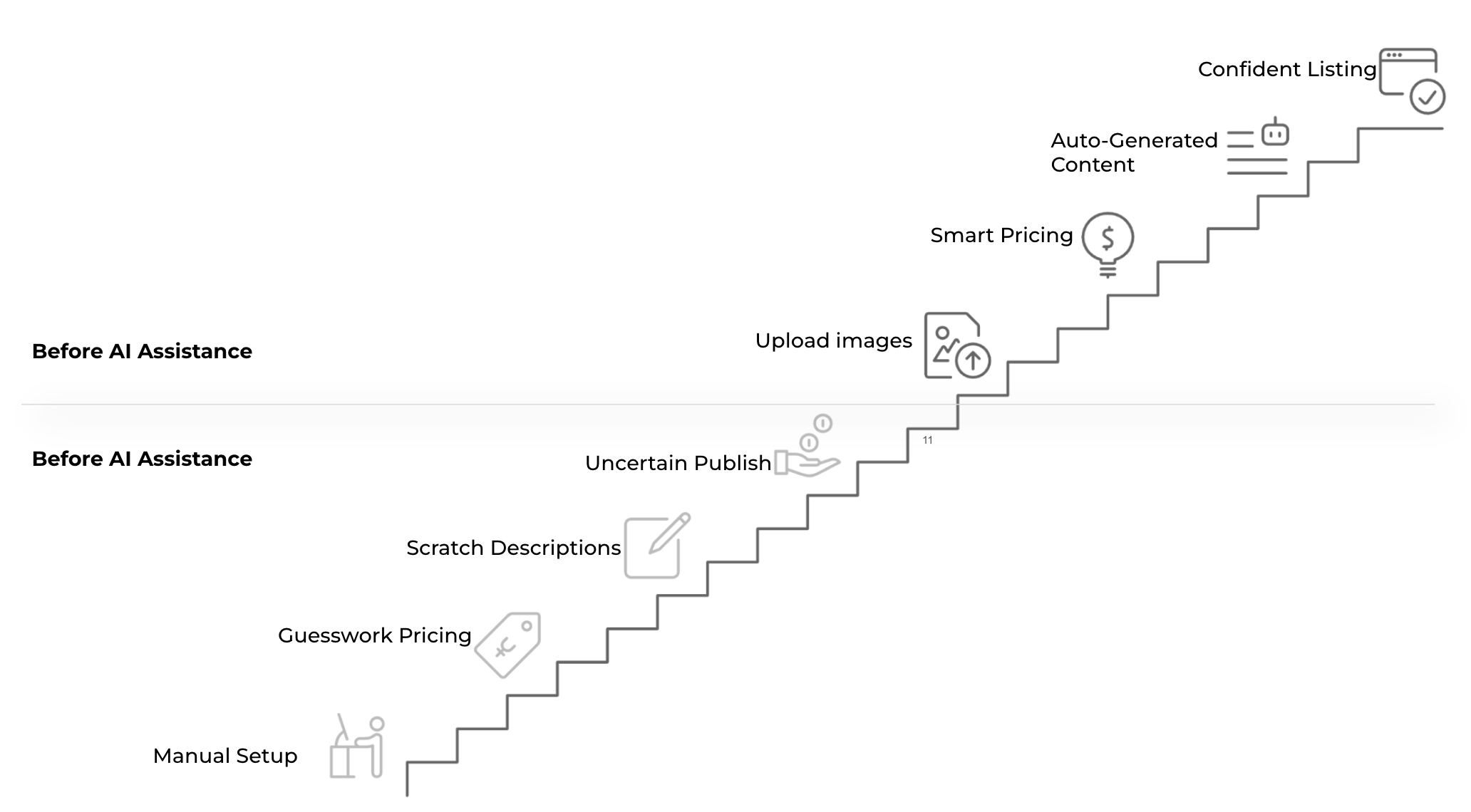
The AI lift staircase — each step in the old flow (Manual Setup, Guesswork Pricing, Scratch Descriptions, Uncertain Publish) maps directly to an AI-powered replacement (Image Upload, Smart Pricing, Auto-Generated Content, Confident Listing). The staircase shows the design is additive, not replacement-based.
Design Principles and UX Laws AppliedI grounded every decision in established UX principles, not as box-checking, but as a shared vocabulary for making principled tradeoffs with engineering and product stakeholders.
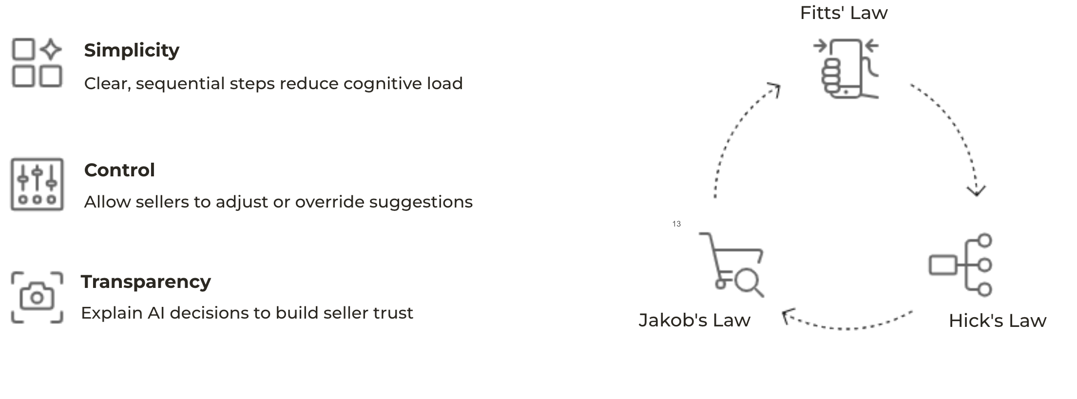
Three design principles + three UX laws — Simplicity (clear sequential steps reduce cognitive load), Control (sellers can adjust or override every suggestion), Transparency (explain AI decisions to build trust). Grounded in Fitts' Law (large touch targets on mobile), Hick's Law (fewer choices at each step), and Jakob's Law (familiar patterns lower the learning curve).
Designing with AI, Carefully
This wasn't about sprinkling AI for the sake of it. Every AI feature was justified by a specific seller pain point, constrained by trust principles, and validated in research before a single pixel was placed. The guiding rule: AI as co-pilot, never autopilot.
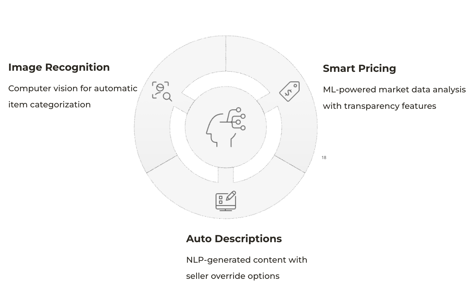
Three AI pillars — Image Recognition (computer vision for automatic item categorization from photos), Smart Pricing (ML-powered market data analysis with built-in transparency features), Auto Descriptions (NLP-generated listing content with seller override options). Each pillar maps directly to a pain point from research.
A significant portion of my work happened in the gap between what the AI could generate and what the listing UI actually needed. I spent weeks iterating on prompts, treating them like design artifacts with the same rigor I'd give any interface component.
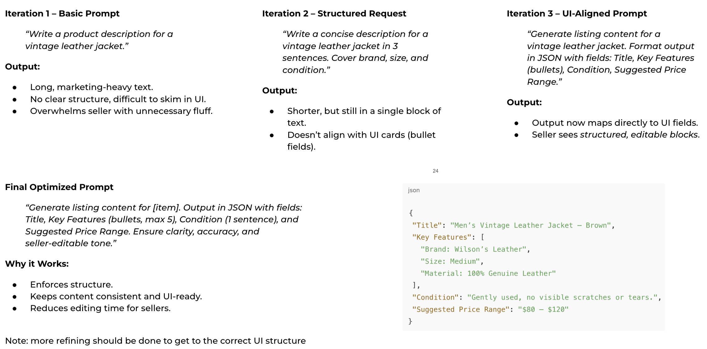
Three prompt iterations to get to production-ready output — Iteration 1 produced long, marketing-heavy text that overwhelmed sellers. Iteration 2 was shorter but still a single text block that didn't map to UI fields. Iteration 3 added JSON structure, mapping output directly to editable UI components. The final prompt enforces structure, keeps output UI-ready, and reduces seller editing time.
| Prompt Variable | Design Intent | User Outcome |
|---|---|---|
| Item category context | Guide model to use category-appropriate language and terminology | Descriptions that sound like they were written by a knowledgeable seller |
| Length constraint | Cap output at 80-120 words to fit eBay's listing field | No truncation anxiety; sellers see a usable output immediately |
| Condition signal | Include seller-provided condition so AI sets accurate buyer expectations | Reduced post-sale disputes; improved buyer trust scores |
| Tone parameter | Offer "professional" vs. "friendly" tone toggle for seller preference | Sellers felt the listing sounded like them, increasing adoption |
| JSON structure output | Require model to return structured fields that map directly to UI components | Each AI output slots into an editable card; sellers see structure not a blob of text |
Prompt variable breakdown — five design parameters engineered into every AI content generation request. Each one addresses a specific failure mode found in early usability testing. The final JSON-structured prompt reduced seller editing time and made AI outputs slot directly into individual editable UI cards.
From Concept to Click-Through Reality
Each feature went through multiple rounds of prototyping and usability testing with real sellers before engineering got involved. Nothing was handed off without validation. The evolution below shows how each iteration answered a specific question the research raised.
The First "Generate with AI" Flow
The earliest prototype tested whether sellers would even trust an AI-generated listing. We kept the UI familiar but introduced a single new action: a "Generate with AI" button after photo upload. The entry point was still a blank form, but the AI offered to fill it.
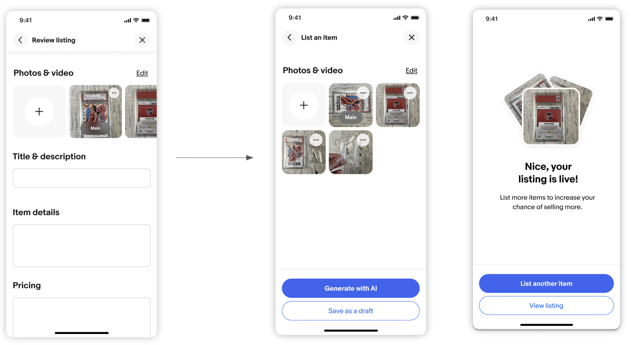
V1 concept — familiar listing form (left) transitions to a photo-first screen with "Generate with AI" as the primary action (center). After AI generation, sellers land on a success screen: "Nice, your listing is live!" (right). Simple but it validated the core proposition: sellers would use the button.
Showing the AI Working in Real Time
V1 had a gap: sellers clicked "Generate" and saw nothing until it was done. That waiting felt like an error. V2 introduced a visible generation state, showing the AI actively building the listing field by field.
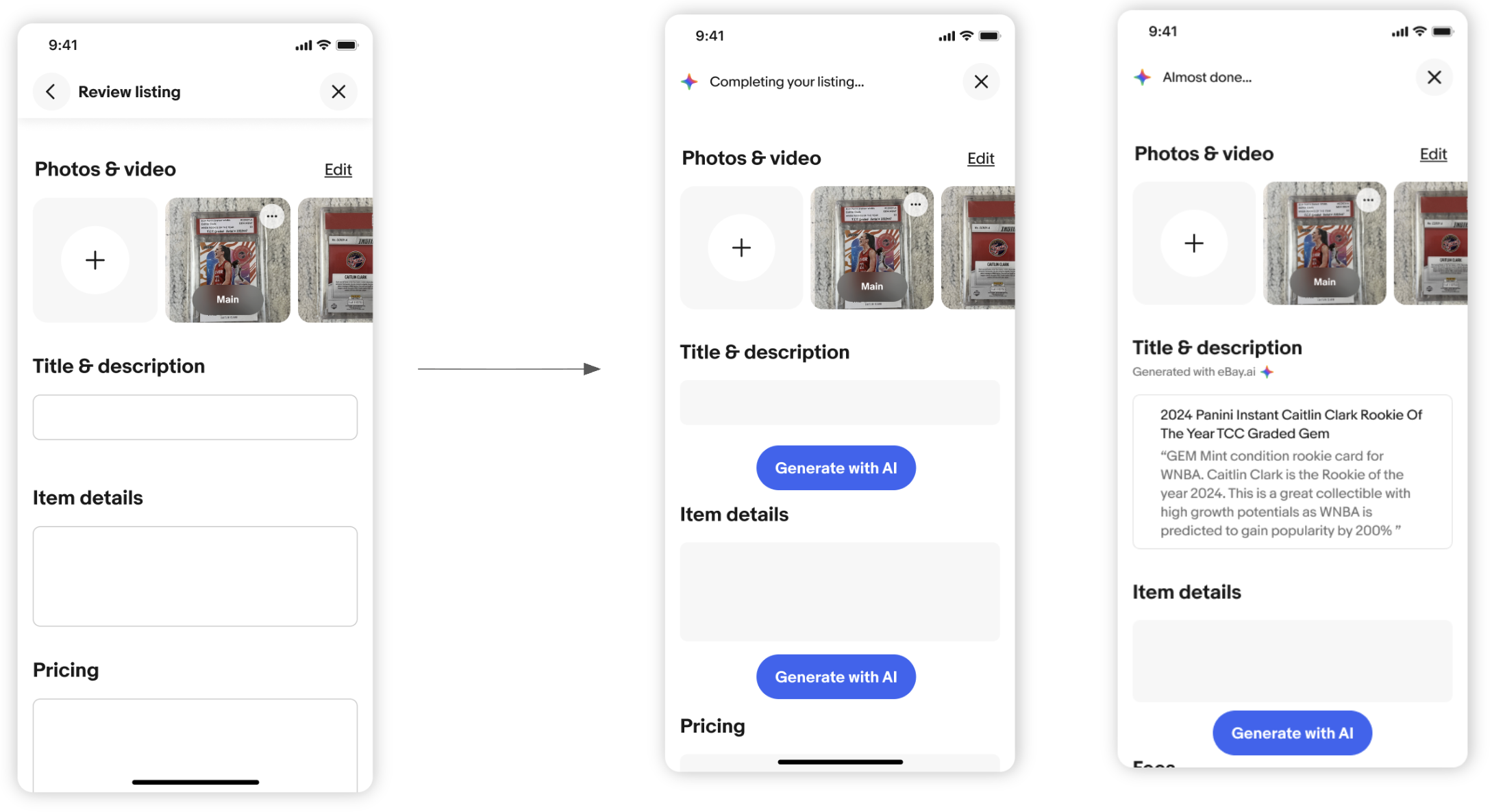
V2 concept — the same blank form (left) now transitions through a "Completing your listing..." state (center) with visible progress, landing on an "Almost done..." screen (right) where sellers can already see the AI-generated title and description before fully committing. The eBay.ai branding appears for the first time here.
Phase 2 broke the prototype into four focused problems. Each iteration was a question: How do sellers start? What happens while they wait? How do we handle uncertainty? How much control do they need once it's done?
Uploading Photos: Redesigning the Entry Point
The old entry point was a blank form. The new entry point is a camera. Sellers can take a photo, record a video, scan a barcode, or upload from their camera roll. The moment they add a photo, eBay.ai starts working.
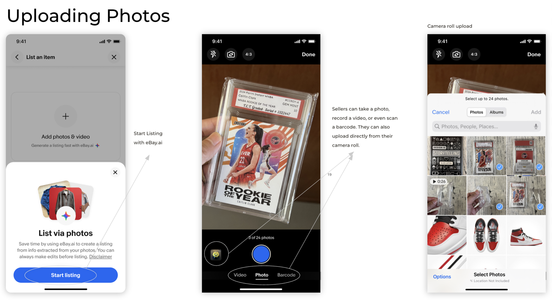
Uploading Photos — entry screen with "List via photos" bottom sheet prompt (left), live camera with Video/Photo/Barcode tabs (center), and camera roll selector with multi-photo support up to 24 photos (right). The eBay.ai star icon marks this as an AI-powered action throughout.
Listing Loader: Making the Wait Feel Like Progress
When the AI takes time, silence reads as error. This iteration designed the loading state as a visible, trustworthy checklist. Sellers could see exactly which fields the AI was filling. When a catalog match was found, it surfaced the matched item immediately to build confidence.
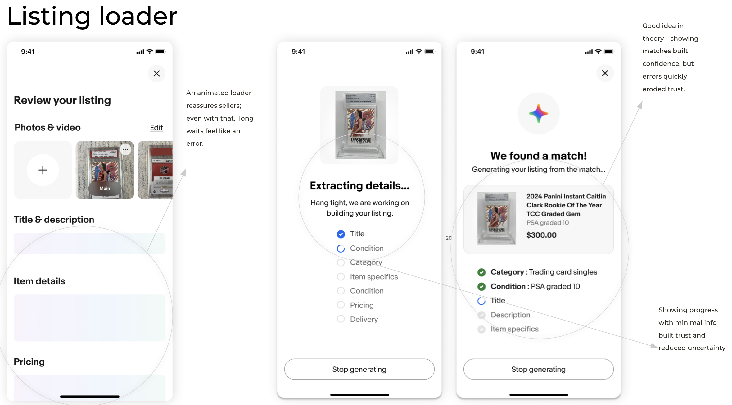
Listing Loader — "Extracting details..." with a real-time checklist (Title, Condition, Category, Item specifics, Pricing, Delivery) plus a "Stop generating" escape hatch (center). When the AI finds a catalog match, it shows the item card: "We found a match!" with matched category, condition, and pricing details (right). Note: showing matches built confidence, but early catalog errors quickly eroded trust, which drove iteration 3.
Load Quick Tips: Filling the Wait with Value
Catalog matching errors from iteration 2 taught us to be more careful about what we showed during the load state. This iteration replaced the premature match reveal with educational tips, while the generation progress ran quietly in the background with full branding clarity.
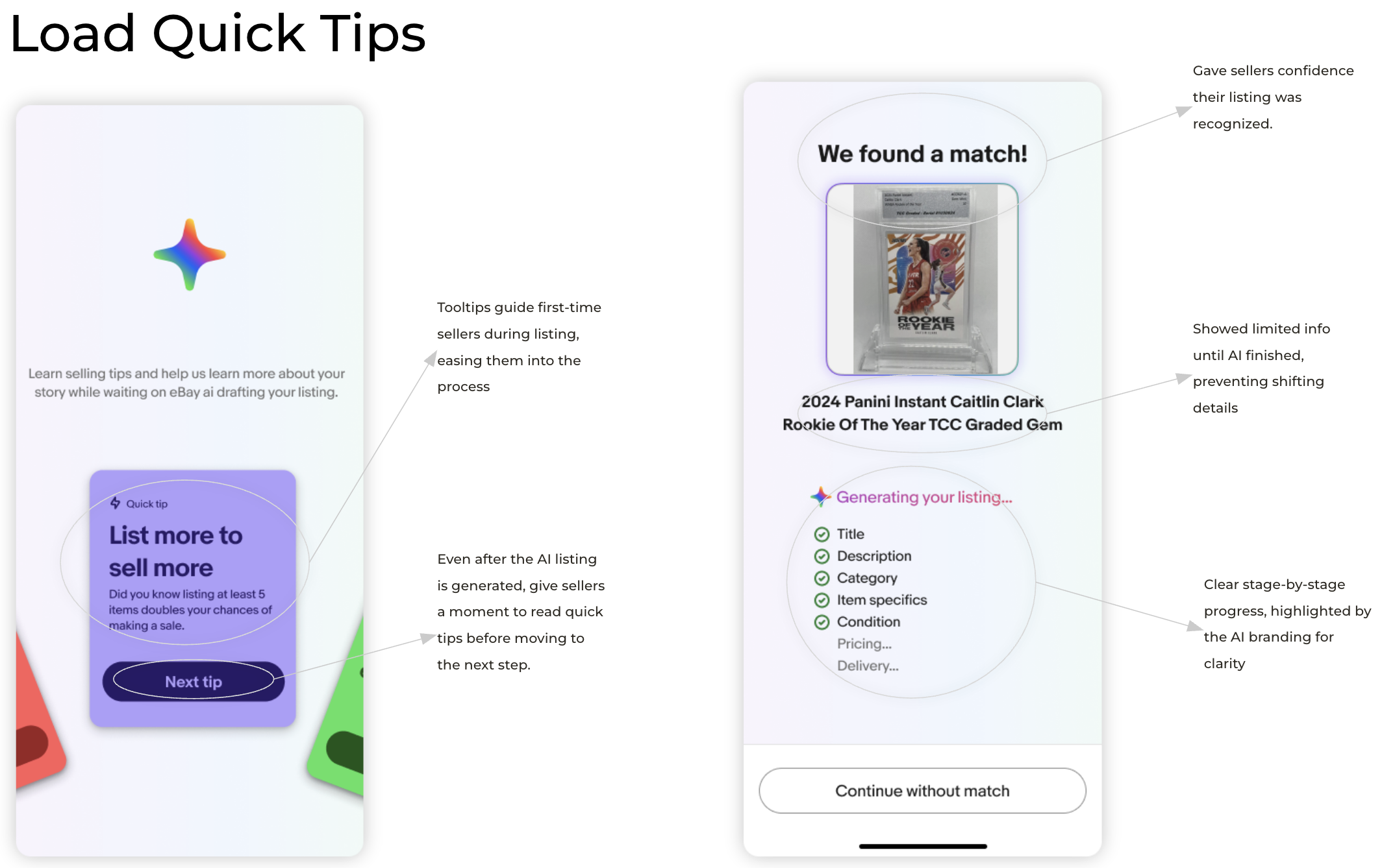
Load Quick Tips — a "Quick tip" card teaches sellers best practices while the AI works (left). Once generation is complete, the "We found a match!" screen reveals limited info until all fields are ready, preventing jarring layout shifts (right). The eBay.ai star icon and progressive checklist (Title, Description, Category, Item specifics, Condition checked; Pricing and Delivery still loading) give clear stage-by-stage progress.
Edit States: Full Seller Control After Generation
Once the AI was done, sellers needed to feel in control of the result, not handed a finished product they couldn't touch. This iteration designed the review and edit experience so sellers could modify any section, regenerate specific fields, or view the AI's reasoning before making changes.
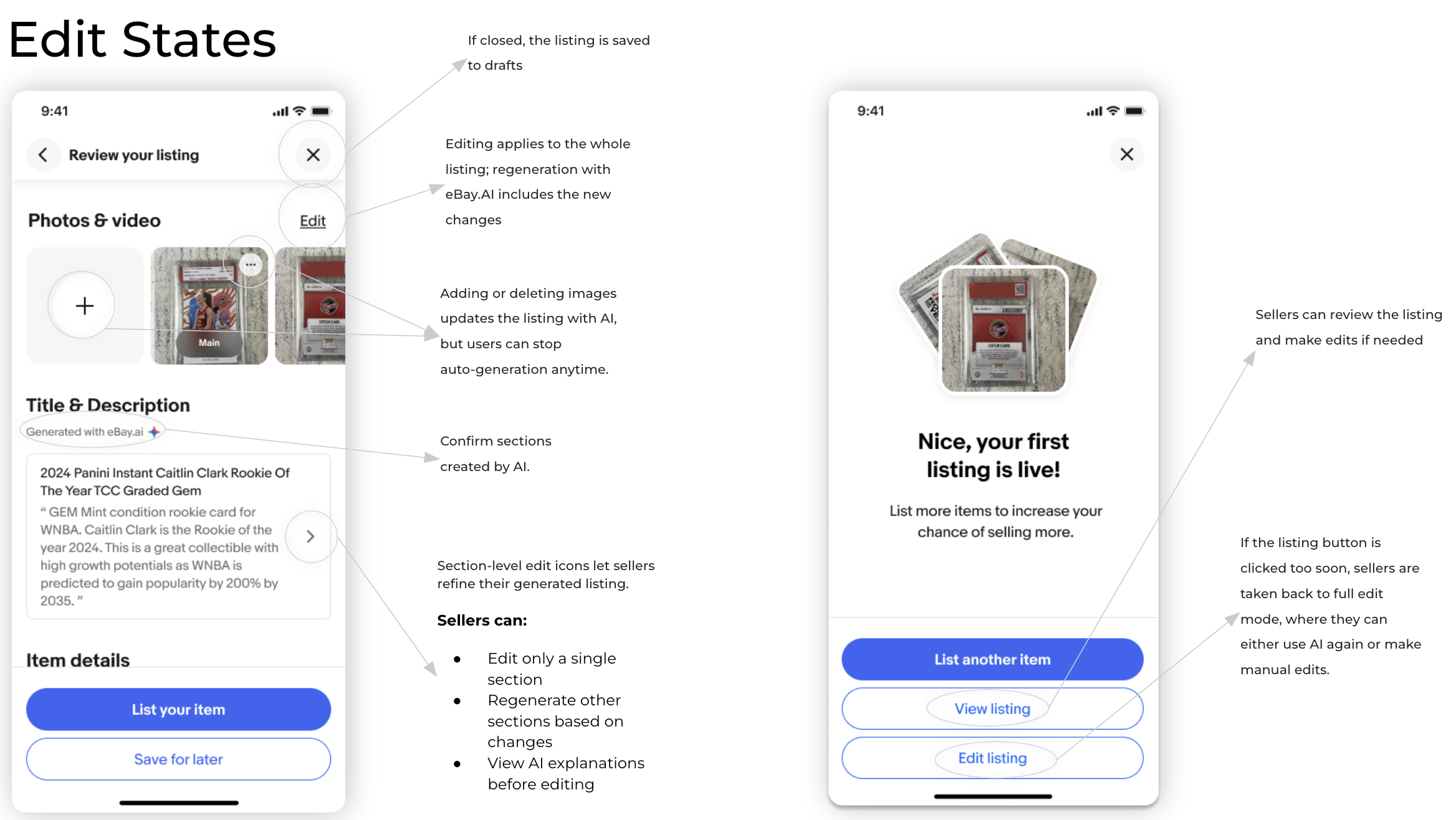
Edit States — the review screen (left) shows "Generated with eBay.ai" attribution on each AI-created section, with section-level edit icons so sellers can refine without regenerating everything. Sellers can edit a single section, regenerate other sections based on changes, or view AI explanations before editing. Adding or deleting photos triggers an AI re-generation, but sellers can stop it anytime. The success screen (right) offers three actions: "List another item", "View listing", "Edit listing."
Every prototype round exposed a real tension between speed and trust, automation and control. Rather than paper over these tensions, I documented each one, named the tradeoff explicitly, and designed a deliberate resolution. These four decisions shaped the final product as much as any feature.
| Design Challenge | What Changed | The Tradeoff | Result |
|---|---|---|---|
| Automation vs. Seller Control | Moved from full auto-listing to AI draft + seller review after sellers rejected outputs they didn't control | Slightly slower listings vs. significantly stronger seller confidence and trust | Sellers actively engaged in reviewing and editing, gaining ownership over the final listing |
| Slow AI Image Recognition | Introduced progressive reveal so sellers could begin editing while AI recognition was still loading in the background | Early edits might require rework vs. zero frustration from waiting on a blank screen | Sellers stayed engaged during wait times and reported the process felt faster, even when it wasn't |
| Trust in AI Pricing | Added confidence scores and a "Why this price?" explanation panel anchored to comparable recent sales | Slightly higher cognitive load vs. dramatically improved pricing transparency and seller confidence | +34% price suggestion adoption in A/B testing. Sellers expressed clear trust in AI recommendations for the first time |
| Performance vs. Rich Media | Prioritized instant thumbnail loading over full-resolution image display; added "View Full" as a secondary action | Lower initial image fidelity vs. a fast, smooth listing experience that never feels stalled | Sellers experienced seamless performance without feeling like image quality was compromised |
Design tradeoffs resolved across four prototyping rounds — each row documents a deliberate design decision made under competing constraints. Every tradeoff was named before iteration began so the team could evaluate against a clear before-and-after baseline, rather than rationalizing outcomes after the fact.
Interactive walkthrough of the complete Phase 4 listing flow will go here
End-to-end demonstration of the shipped Magical Listings experience will go here
Results That Moved the Marketplace
Features shipped in phased rollouts, with A/B testing and post-launch seller interviews at each stage. Every number below was measured before and after, against a control or baseline. I helped design the measurement approach from the start, because if you don't define success before you ship, you'll rationalize whatever you get after.
My Role and What I Learned
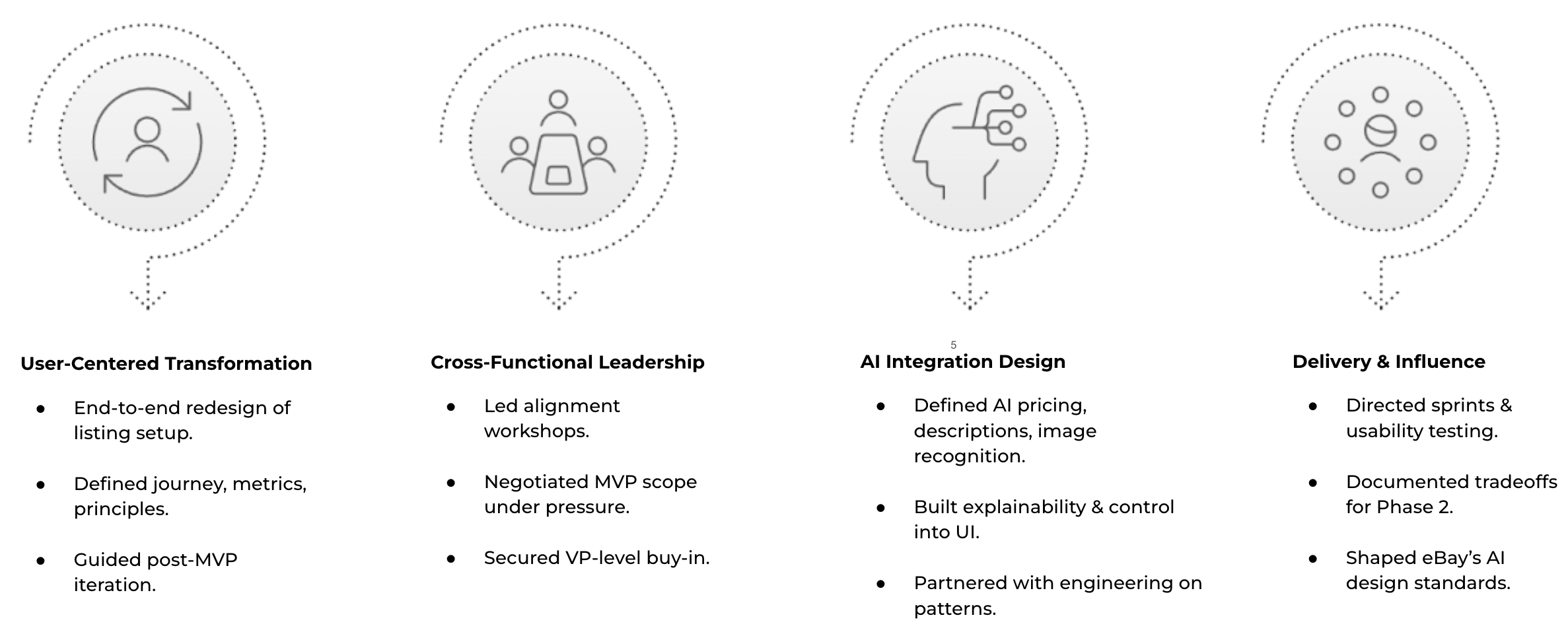
Four dimensions of my contribution — User-Centered Transformation (end-to-end redesign, journey mapping, post-MVP iteration), Cross-Functional Leadership (alignment workshops, MVP scope negotiation, VP-level buy-in), AI Integration Design (pricing, descriptions, image recognition, explainability and control in UI, engineering partnership on AI patterns), Delivery and Influence (sprint direction, usability testing, Phase 2 documentation, shaping eBay's AI design standards)
Leading Magical Listings was one of the most formative experiences of my career, and not because of the AI. It was because of what the AI forced me to reckon with as a designer. When automation enters the picture, trust design becomes the core competency. Features don't just need to work. They need to be legible, predictable, and controllable in the hands of real people.
Co-pilot beats autopilot, always
Sellers who felt AI was working with them adopted it widely. Sellers who felt it was deciding for them rejected it entirely, even when the outputs were better.
Explainability is a design problem
Adding a "Why this price?" panel increased price suggestion adoption by 34% in testing. People don't just need the right answer. They need to understand it.
Prompt engineering is UX work
The quality of AI outputs is directly shaped by how prompts are designed. Getting involved in prompt iteration was where the highest-leverage design decisions lived.
Research protects AI from itself
Without grounding in real seller needs, AI features risk optimizing for metrics that don't serve users. Research was the check that kept automation in service of people.
Three Calls That Defined the Product
Not the strategy. The specific decisions: what I owned, what I fought, and what I killed before it could hurt the experience.
Requested a 3-week pre-launch delay and held the line
Usability testing surfaced AI outputs that were confidently wrong in edge cases. Not often, but enough. I documented the risk, asked for 3 more weeks, and held the position when product leadership pushed back.
Auto-apply AI descriptions when confidence exceeded 85%
Engineering wanted auto-apply above 85% confidence. It looked better in time-to-list metrics. I refused. Research was unambiguous: sellers who felt AI was deciding for them rejected the entire feature, even when outputs were objectively better. Agency is not a nice-to-have when trust is the product.
The visible confidence percentage indicator
An "87% confident" label next to AI suggestions backfired in testing: sellers anchored on the number and treated it as a guarantee, leading to worse decisions than the control group. I replaced it with a qualitative indicator: Strong match / Good match / Estimate. Simpler. More honest.
Sellers in Their Own Words
Collected 90 days post-launch through structured seller interviews and in-app feedback panels.
"I listed six items in the time it used to take me to list one. The AI wrote better descriptions than I ever could, and I could still edit them to sound more like me."
"The price suggestion with the explanation is the thing I didn't know I needed. I used to just guess. Now I actually understand why I'm setting the price I'm setting."
"I snapped a photo and it filled in half the form for me. I've been selling on eBay for four years and I've never had an experience like that. It felt like the app finally understood what I was trying to do."
One Experience. Two Surfaces.
Sellers don't think in platforms. They photograph an item on their phone and expect to finish the listing on desktop without losing a field, a draft, or an AI suggestion. That level of session continuity doesn't happen by accident — it requires deliberate alignment between surfaces before a single screen is designed.
I worked closely with the Product Design Lead to align our component model, AI output structure, and cross-surface handoff approach across the mobile app and desktop web. The goal was frictionless re-entry: a seller returning to a draft on any device should feel like the product was waiting for them, not asking them to start over.
The harder design problem was state persistence, not visual parity
We had to agree on the interaction model before we agreed on the interface. How should AI-generated content behave in a resumed session? When does a partial draft carry forward? How do we surface contextual re-entry without disrupting the seller's intent? Every decision had to hold up at 375px and 1440px simultaneously — and feel like one product, not two that share a database.
Mobile-to-desktop continuity model — the cross-surface experience map showing how draft states, AI-generated content, and seller decision points persist and re-surface across the eBay mobile app and desktop web listing flow
The full session continuity model — including cross-surface handoff flows, component parity decisions, and AI state persistence logic — is available to walk through on request.
Want the full picture?
The complete Magical Listings case study includes wireframe progression across all four iterations, usability session recordings, AI prompt iteration artifacts, and the full design system. Connect with me on LinkedIn / Nancy-UX to dig deeper.