Yahoo! Ads Data Visualization
The Yahoo! DSP gave advertisers enormous amounts of campaign data. But the interface made it nearly impossible to act on. Account managers were exporting to spreadsheets and building their own charts offline. I led the redesign to make complex data instantly readable, filterable, and actionable.

Redesigned analytics dashboard with adaptive visualizations
Saved filter views
Chart type and metric grouping adapt to the campaign type, surfacing the right data by default instead of a generic view for every campaign.
Saved filter views, shareable filter links, and a recently-used panel eliminated the most common repeated manual configuration.
Automated trend callouts flagged significant metric changes with plain-language explanation, so users understood the data before deciding what to do.
Standardized chart rendering, color encoding, and axis conventions across all Yahoo Ads analytics surfaces, removing the overhead of learning different visual systems.
- User engagement up 25%, with time-on-screen now correlating with value extraction rather than frustration
- Data retrieval time reduced 33% through smarter filtering and adaptive chart defaults
- User satisfaction improved 34% in post-launch survey
Yahoo! Ads Tables
Advertisers lived in these tables all day. Editing required leaving the table. Pacing required drilling into each campaign. Every action broke the flow. I redesigned the core table experience, introducing four capabilities that let advertisers act on data without ever leaving the view.
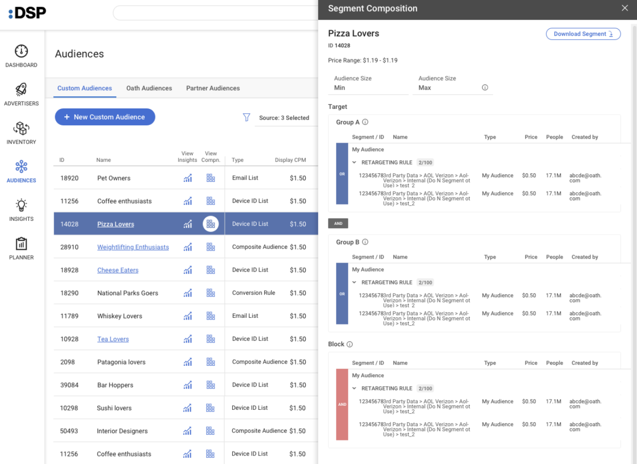
Redesigned campaign table: inline editing and pacing visualization
Campaign detail without leaving the table
Column-level filtering with multi-condition logic, scoping the view to exactly the campaign segment needed without losing context.
Direct editing of budget, bid, name, and status within the table row, eliminating the full-page edit workflow for the most common changes.
Inline pacing bar on each row showing spend trajectory against daily and lifetime budget, making underperformance visible at a glance.
Slide-in panel for quick actions and summary data on the selected row, providing detail-page depth without losing comparative table context.
- Task efficiency up 38%: most common campaign edits now completed in the table, no navigation overhead
- User satisfaction improved 27% in post-launch survey
- 80% of active users engaged with the pacing bar in the first two weeks after launch
Yahoo! Ads Rebranding & UI Unification
Yahoo! Ads had 14 different shades of "Yahoo blue" in use across surfaces. The brand was aging in a modernizing market. I led the full rebrand from audit to launch and used the migration as a forcing function to fix 200+ UI inconsistencies across 6 surfaces simultaneously.

Brand direction: final visual identity
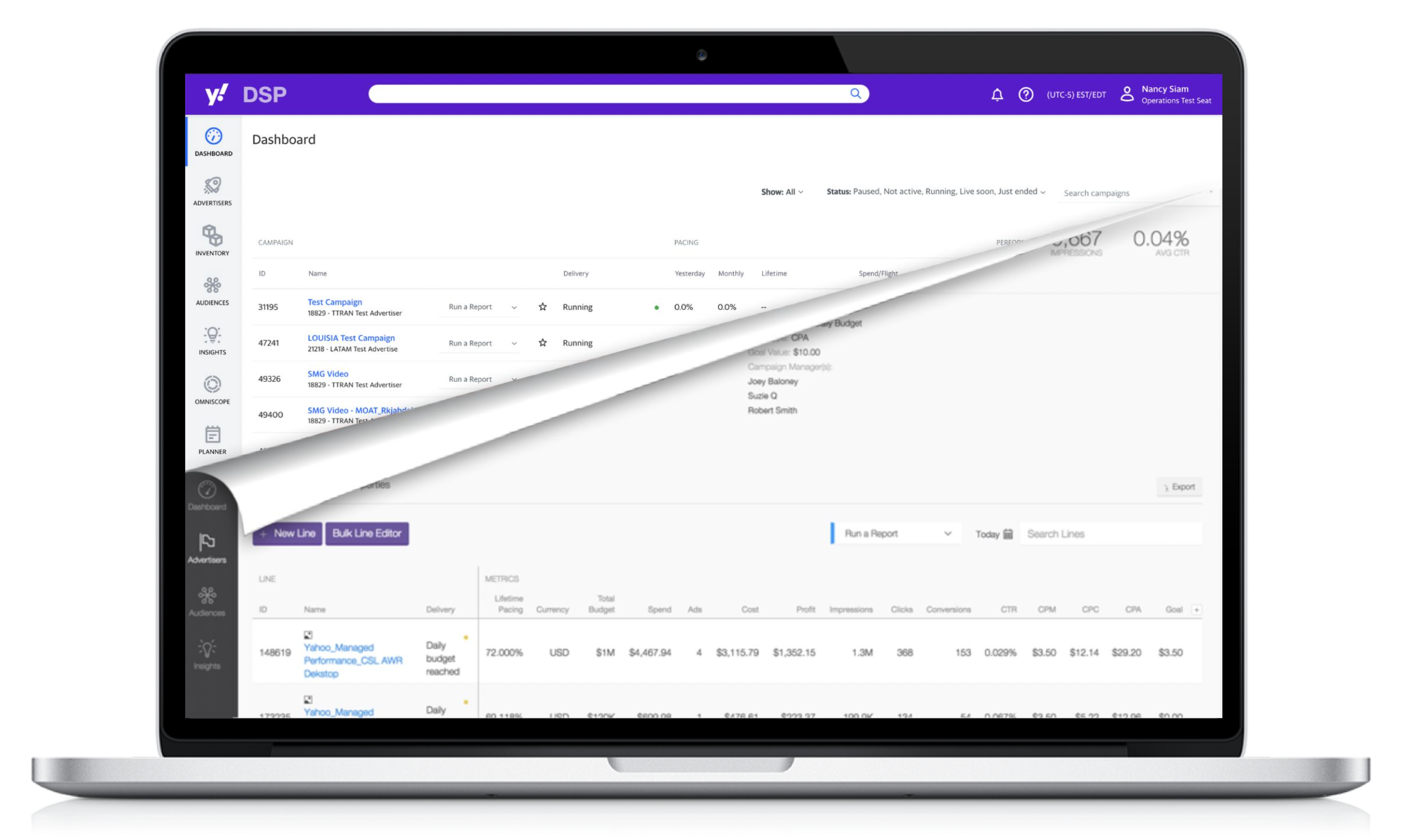
Before / after: Yahoo! Ads brand evolution
Documented all brand touchpoints across product UI, marketing, and sales. Found 14 shades of Yahoo blue in active use.
Developed and pressure-tested three distinct direction boards with internal and external audiences before committing to the final direction.
Defined the single authoritative version of each of 12 core component types, selected for accessibility, usage, and brand alignment.
Established a weekly design review for teams to flag new patterns before shipping — a practice that became permanent after the rebrand launched.
UI System Unification
The rebrand created the opportunity to fix something the platform badly needed. I ran a parallel UI audit, catalogued over 200 inconsistencies across 6 surfaces, and used the brand migration as the forcing function to implement canonical component standards platform-wide. One rollout, two outcomes.
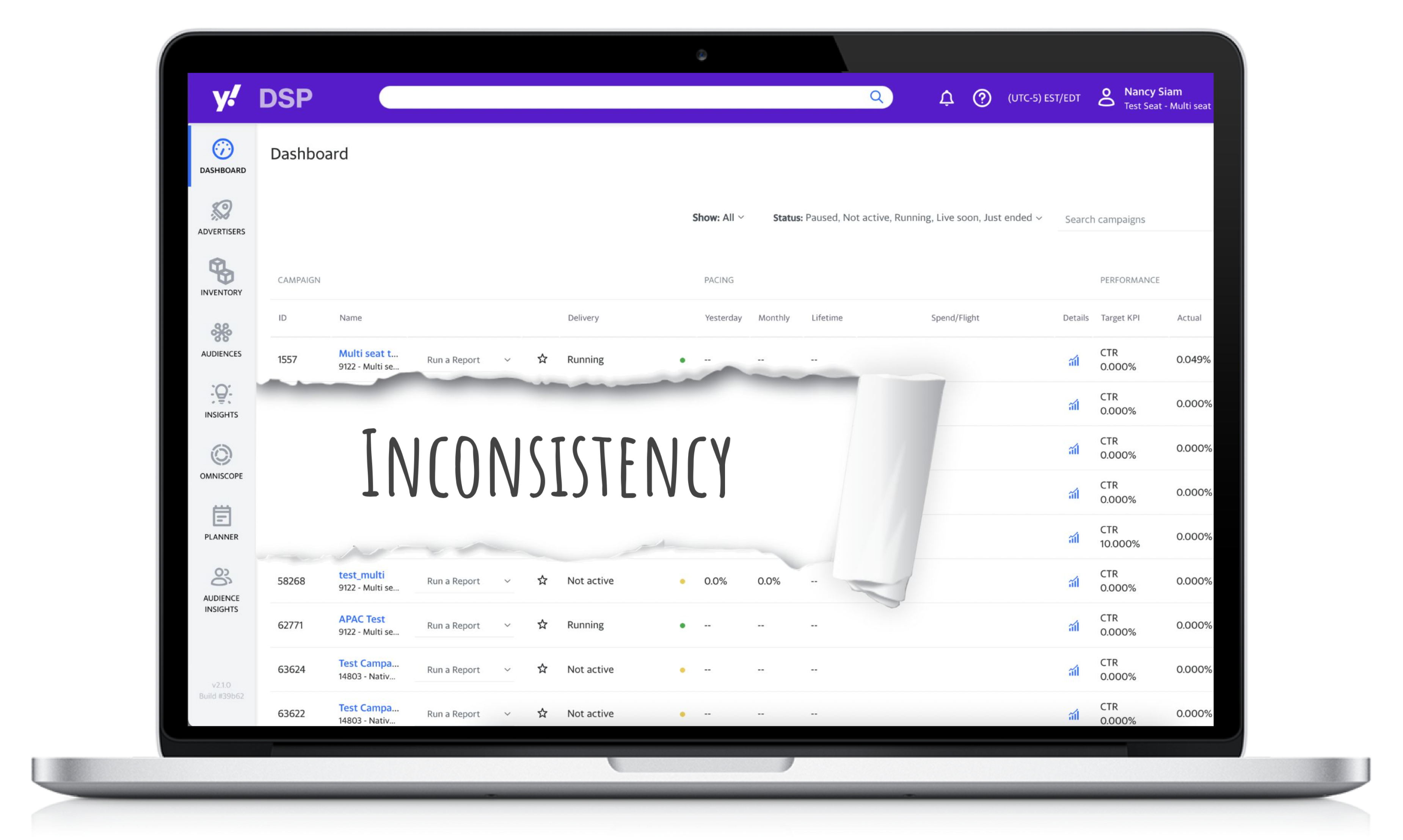
Cross-surface inconsistency audit overview
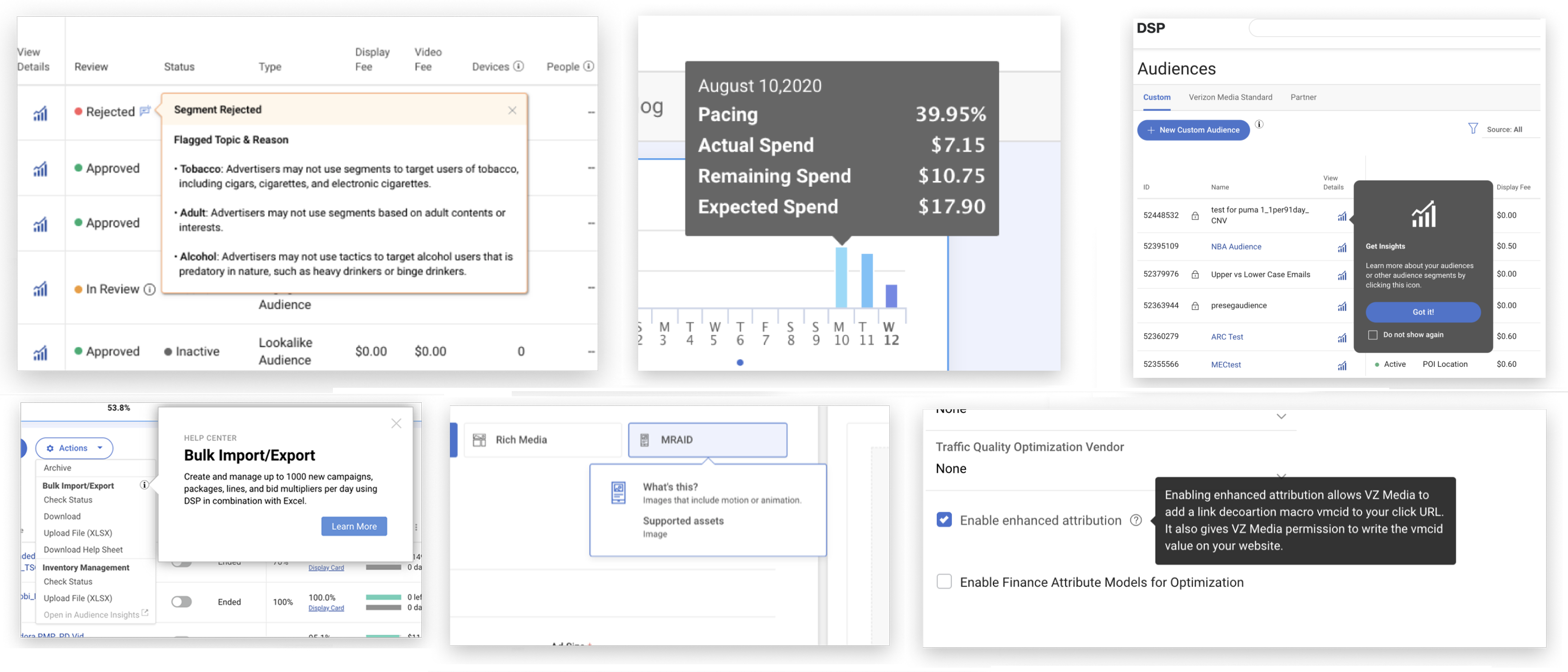
Component variation examples before unification
- 22% increase in brand recognition in post-launch advertiser survey
- 14 legacy color variants consolidated into a single token-based color system
- 200+ UI inconsistencies resolved across 6 surfaces in one release cycle
- UI-related bugs down 40% after component standardization
Watch the Award Presentation
The Yahoo! Bravo Award was presented to Nancy for brand leadership on the Yahoo! Ads Rebranding project.
Yahoo! BiDi Language Support
At Yahoo!, RTL across portals was inconsistent at best and broken at worst. Arabic and Hebrew together represent hundreds of millions of users. I led the Centre of Excellence for BiDi design and built an internal automation tool that flipped UI layouts automatically, cutting manual mirroring work by 80%.
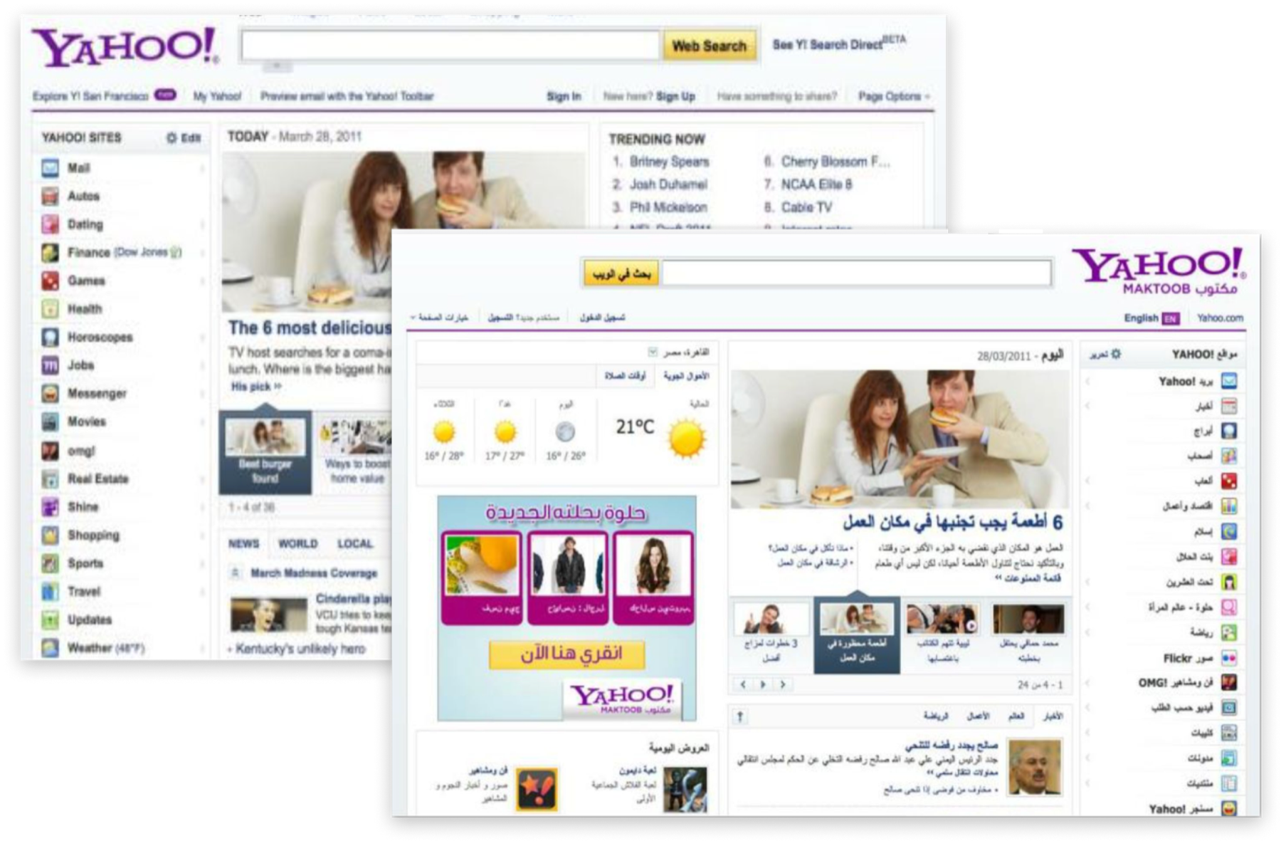
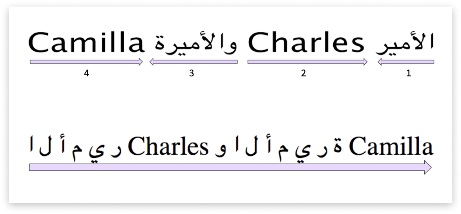
BiDi design standards: LTR / RTL layout principles

Component RTL specifications: navigation mirroring
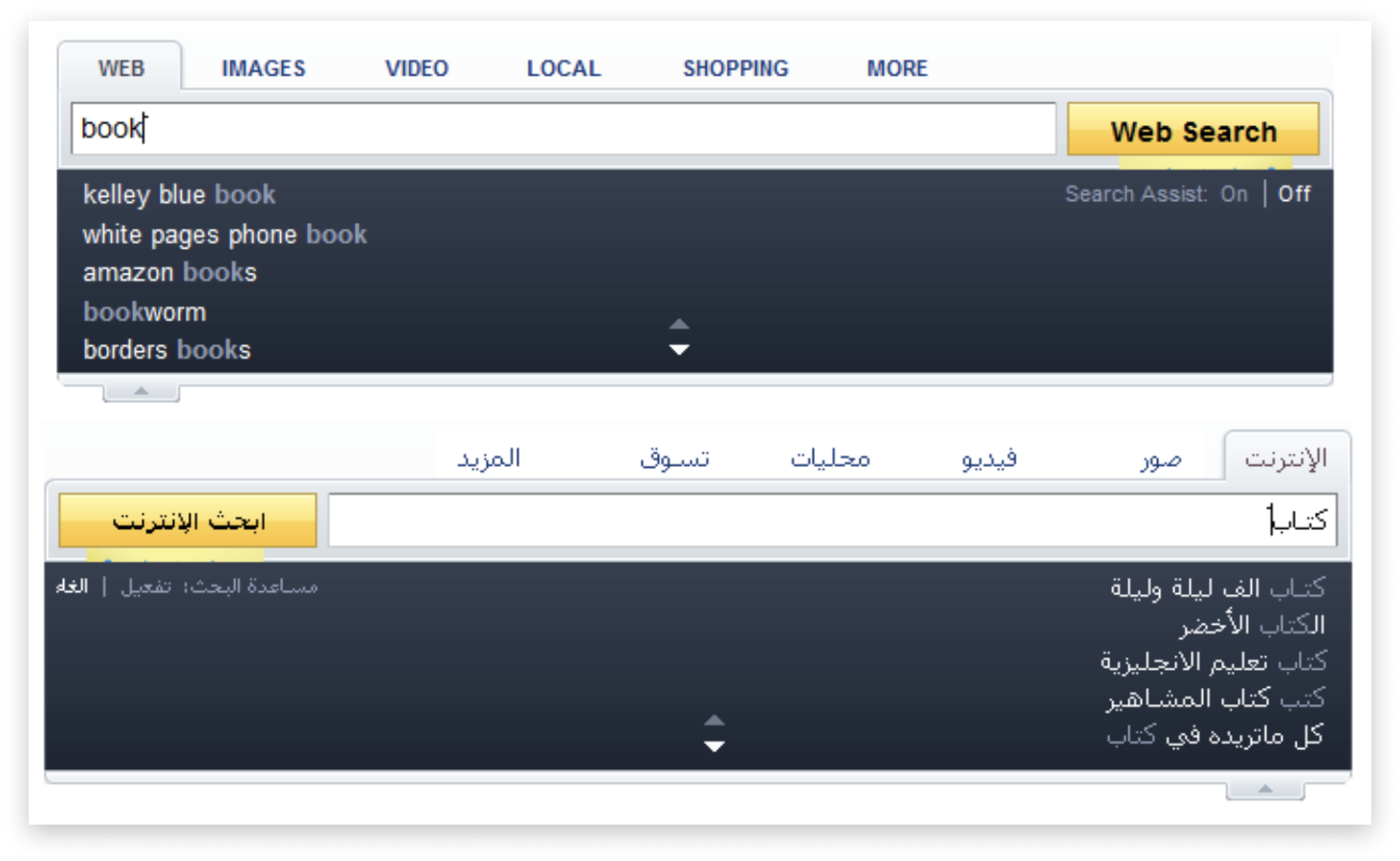
Portal RTL rollout: Yahoo! Mail Arabic
Portal RTL rollout: Yahoo! Finance Hebrew
Authored the Yahoo! RTL Design Standards covering layout mirroring, typography, icon directionality, number formatting, and animation direction.
Added RTL specs to every component in the design system, including mirrored layouts, directional icon variants, and text alignment rules.
Built tooling that automated significant portions of the LTR-to-RTL translation process, cutting the manual overhead that had been a bottleneck by 80%.
Established a cross-functional community of practice running monthly workshops and maintaining a shared knowledge base of 80+ documented patterns.
- Full RTL support rolled out across 7 Yahoo! portals, reaching hundreds of millions of Arabic and Hebrew users
- 60% reduction in translation overhead through localization automation
- BiDi CoE became a durable internal resource, still referenced years after the initial rollout
- RTL component specs became a required part of the Yahoo! design system contribution process
Yahoo! Mail Accessibility
68% WCAG 2.1 compliance on a product used by hundreds of millions. Screen readers couldn't navigate the folder tree. Keyboard users lost focus mid-flow. Low-vision users faced contrast failures throughout. I treated accessibility as a quality dimension, the same standard as visual design or performance, and drove it through the organization as such.
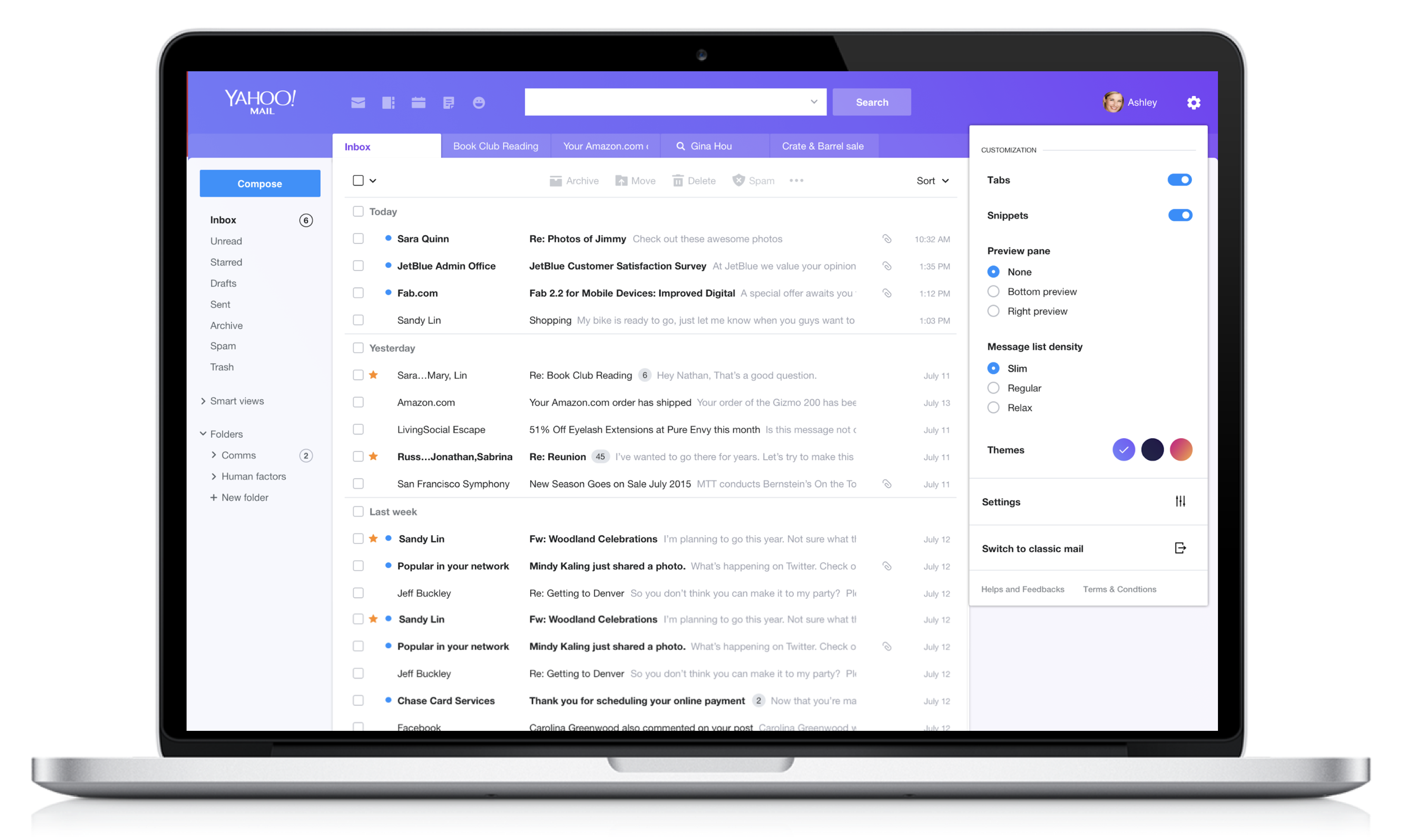
Accessibility audit overview
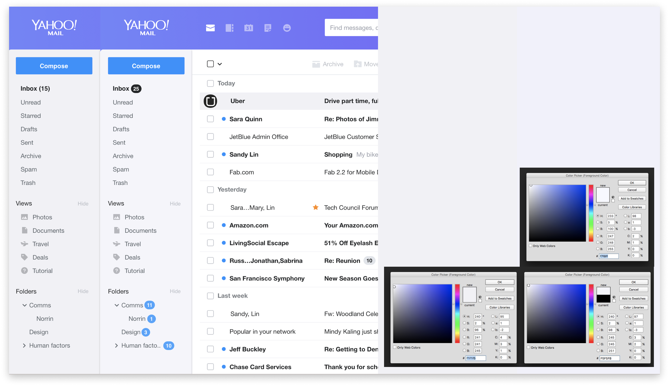
Focus management redesign
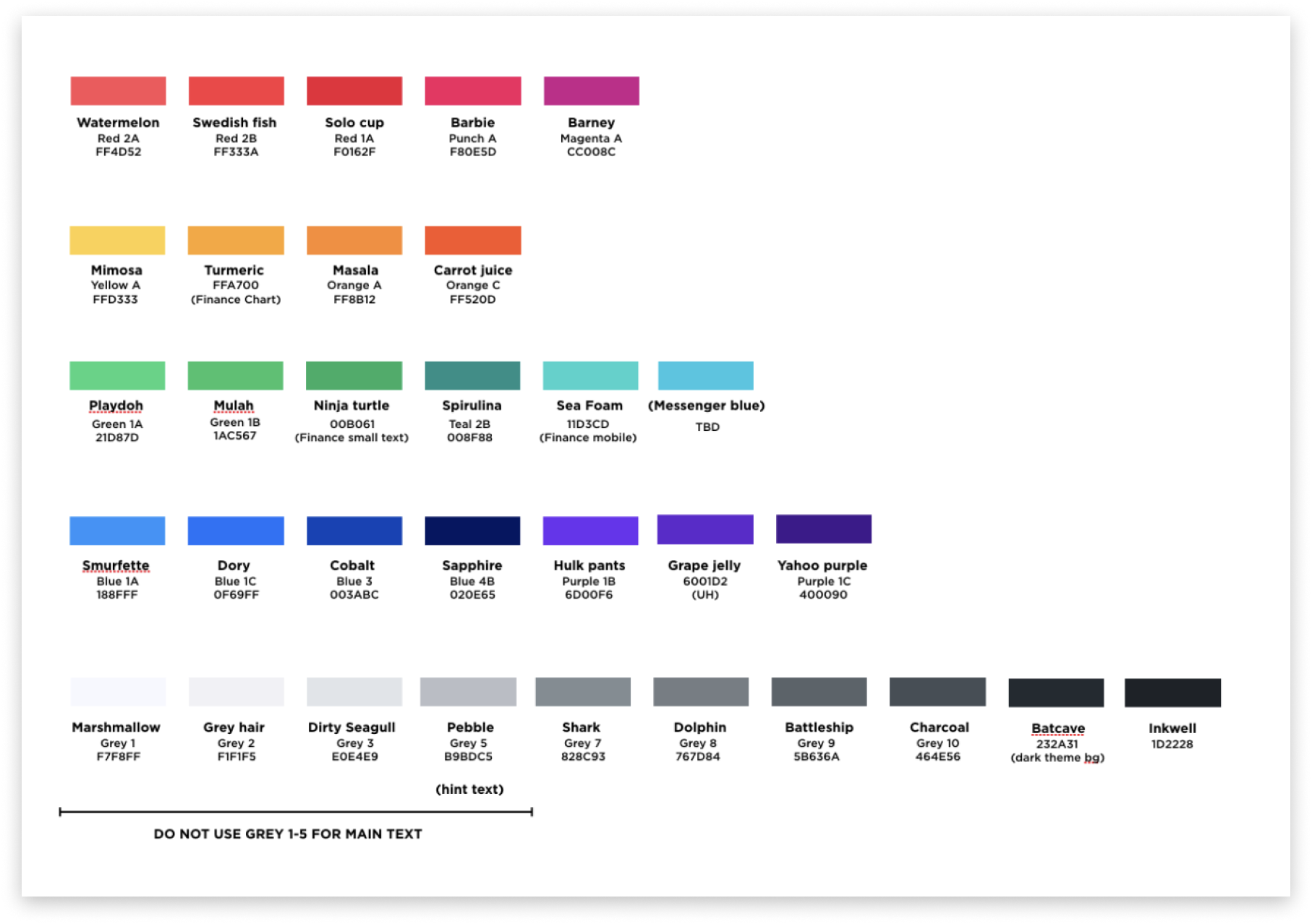
ARIA landmark structure
Redesigned focus flow for all modal interactions, restoring logical focus order and proper return-focus behavior on dismiss.
Created a systematic ARIA labeling library for all iconographic and non-text interactive elements across the product.
Defined keyboard shortcuts and tab order specifications for all major Mail workflows, documented in the design system.
Updated color tokens to meet WCAG AA minimum contrast ratios, implementing changes globally through the design system team.
- WCAG 2.1 compliance raised from 68% to 96% across Yahoo! Mail primary surfaces
- Zero critical keyboard accessibility blockers in post-audit re-test
- Accessibility standards adopted into the design system, ensuring future features shipped accessible by default
- Positive feedback from screen reader user test cohort: the first time some participants could complete core mail tasks unassisted
Yahoo! Mail Layout & Themes
30% of users reported getting lost navigating to non-inbox folders. The left-rail navigation had grown organically over years, features piled in without hierarchy. And the theme system was buried in settings, outdated, and rarely used. I redesigned navigation architecture and launched a new theme system with dark mode and high-contrast as first-class options.
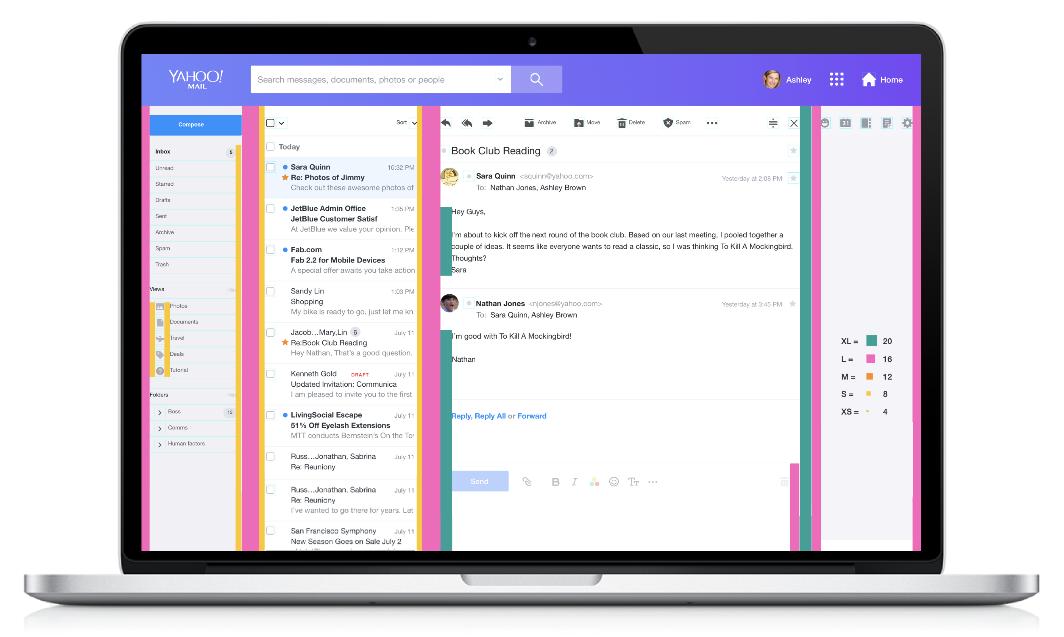
Redesigned Mail navigation: simplified hierarchy
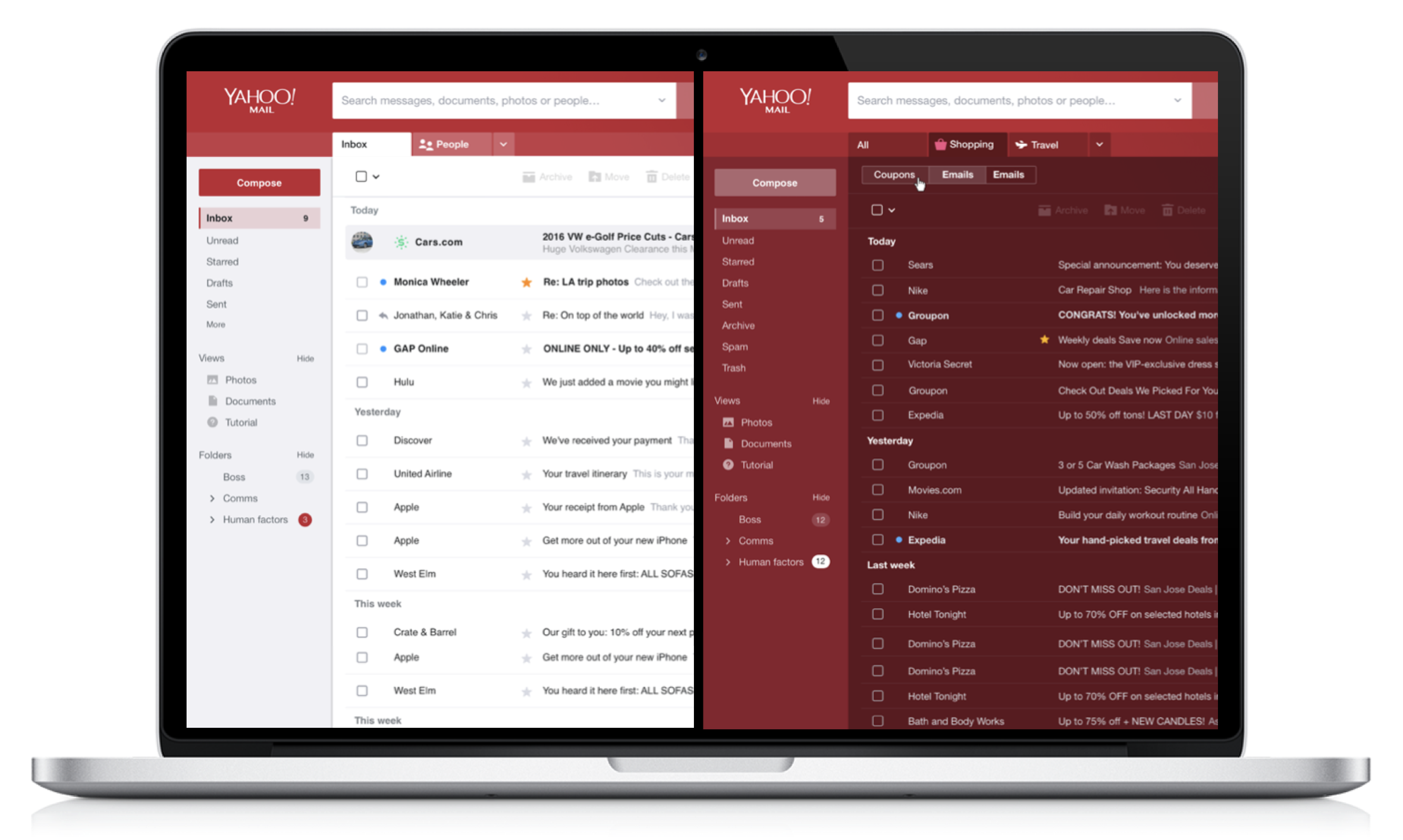
New theme system: selection interface
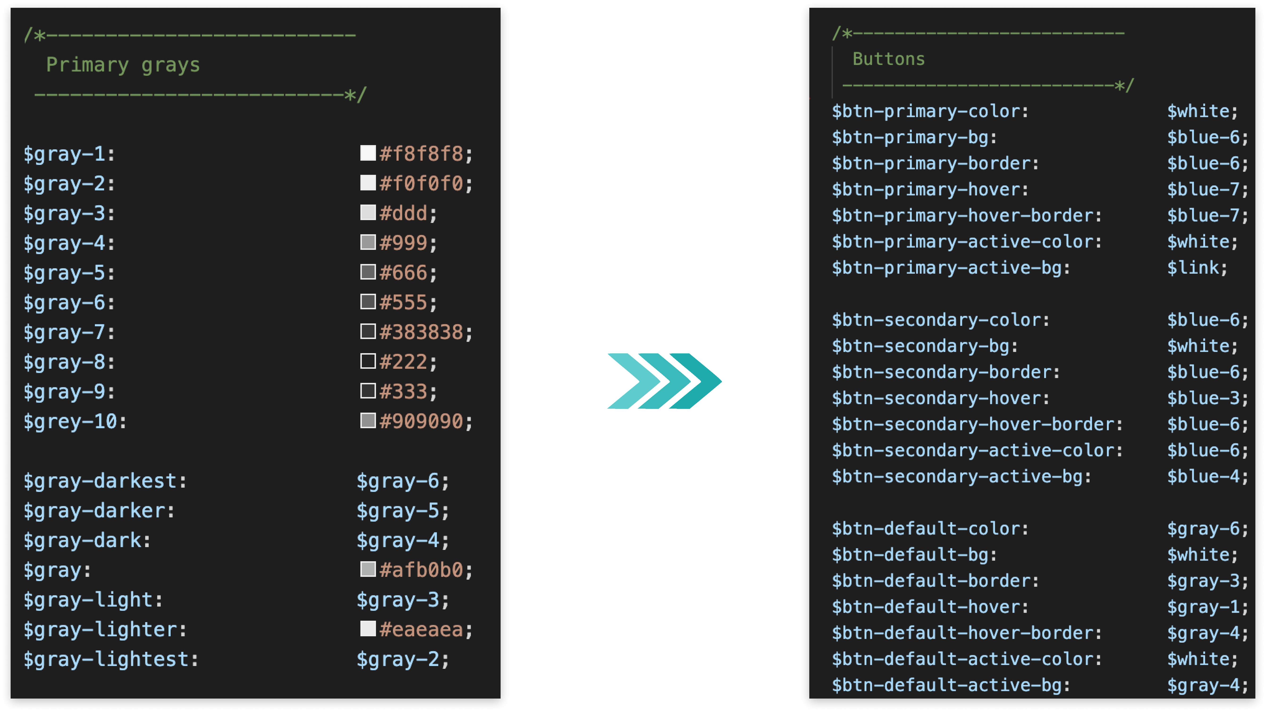
Theme center redesign
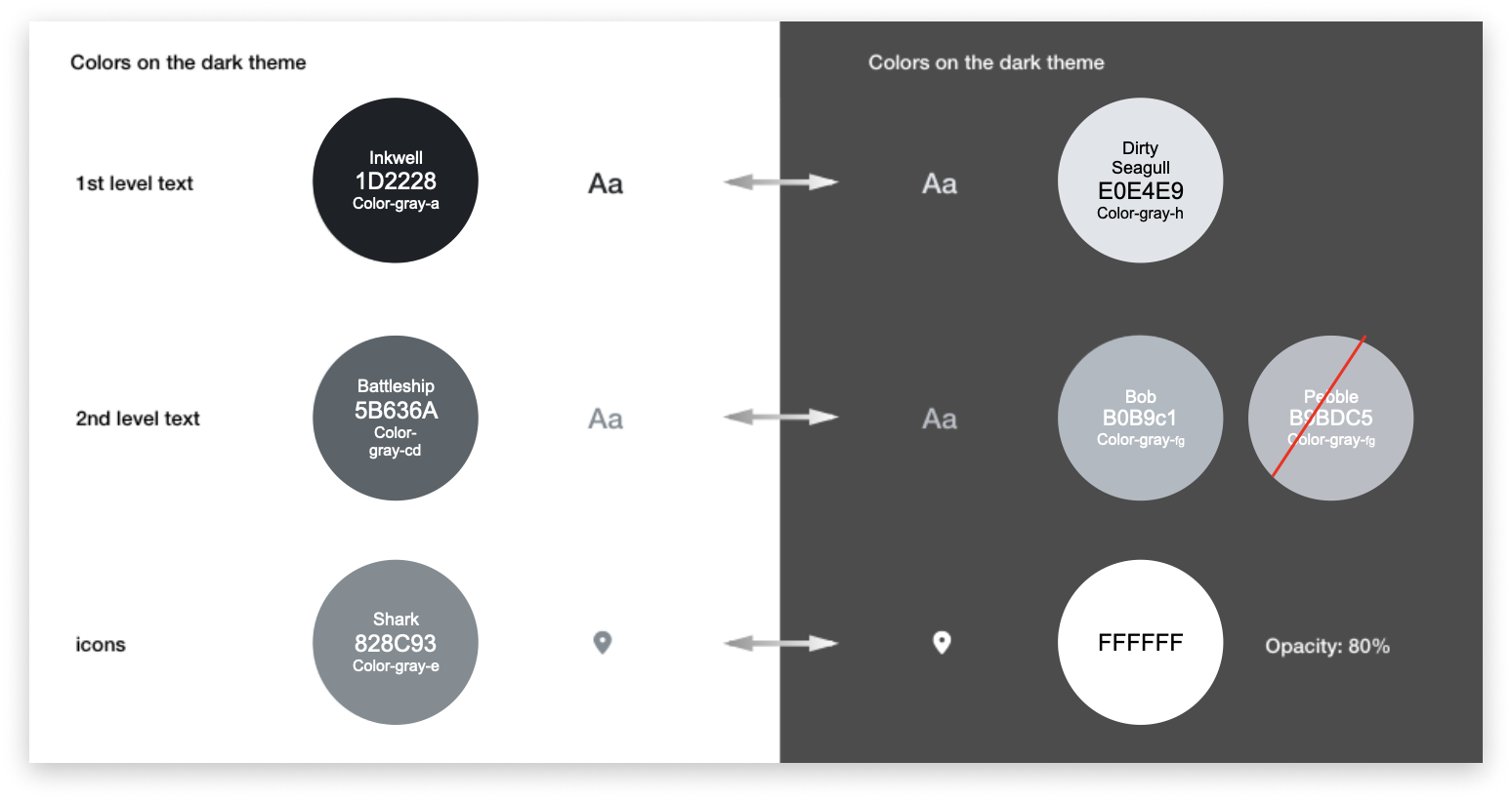
Dark mode: inbox view
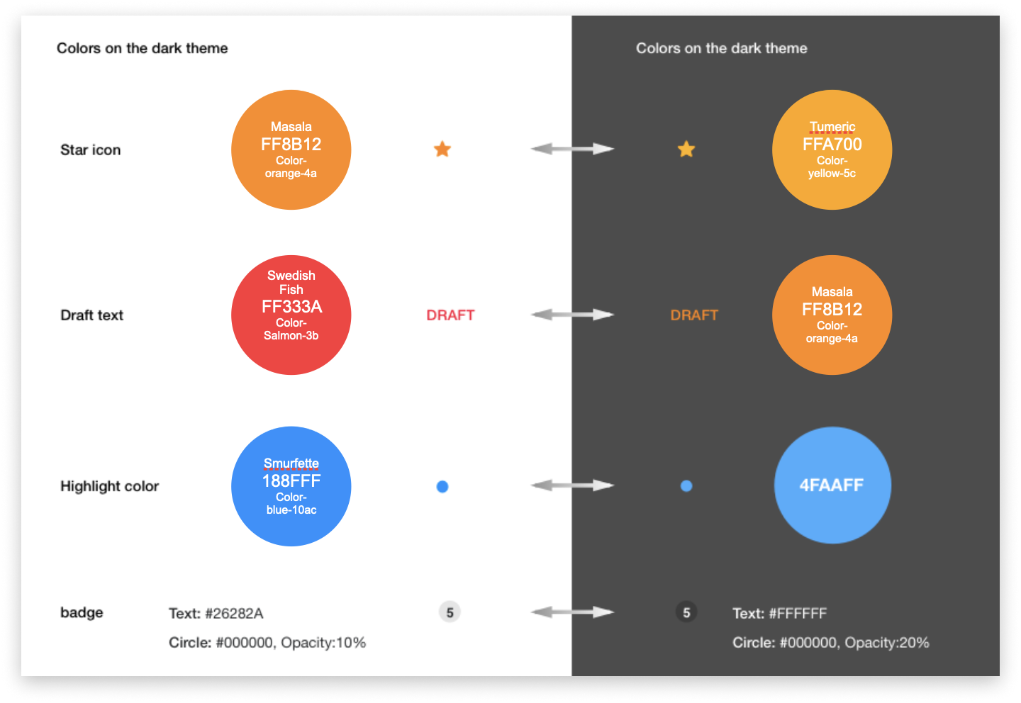
Dark mode: compose view
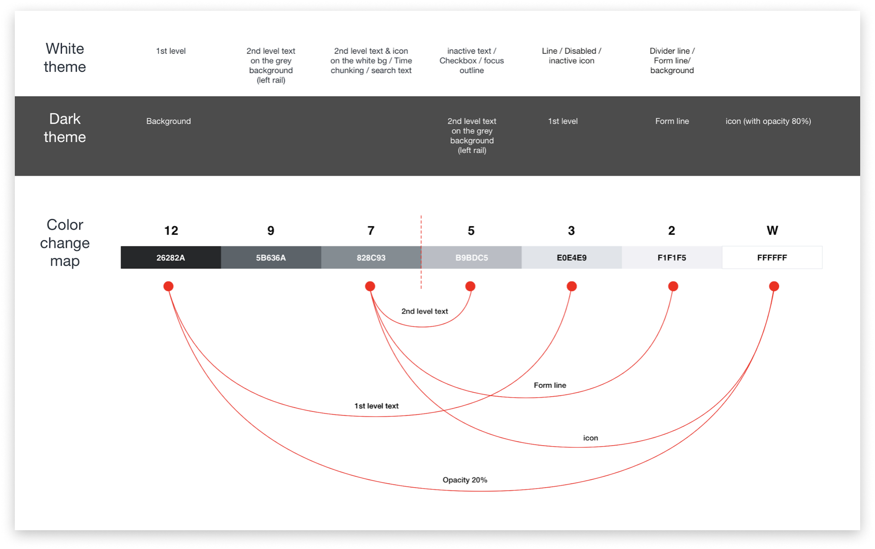
High-contrast mode: full inbox view
Reduced primary navigation to five top-level items with smart folder grouping and progressive disclosure for deep folder trees.
Let users pin up to five frequently accessed folders to the top of the navigation for one-tap access from anywhere in Mail.
Launched Light, Dark, and High Contrast as first-class options, plus a curated collection of seasonal and lifestyle background themes.
Designed a complete dark mode token set ensuring consistent dark treatment across all Mail surfaces, documented for the design system.
- 30% improvement in navigation task completion efficiency in A/B test
- 20% reduction in bounce rate from the inbox view
- Dark mode adoption exceeded projections: 38% of users switched within the first month
- High-contrast mode provided meaningful accessibility improvement for low-vision users